Google Drive is continuing its rollout of the Material 3 Expressive (M3E) redesign, first spotted earlier this month. The update is now reaching more users, introducing several noticeable interface changes — though not all are universally loved.
Key Design Updates
Most of the Material 3 Expressive elements are now widely available:
-
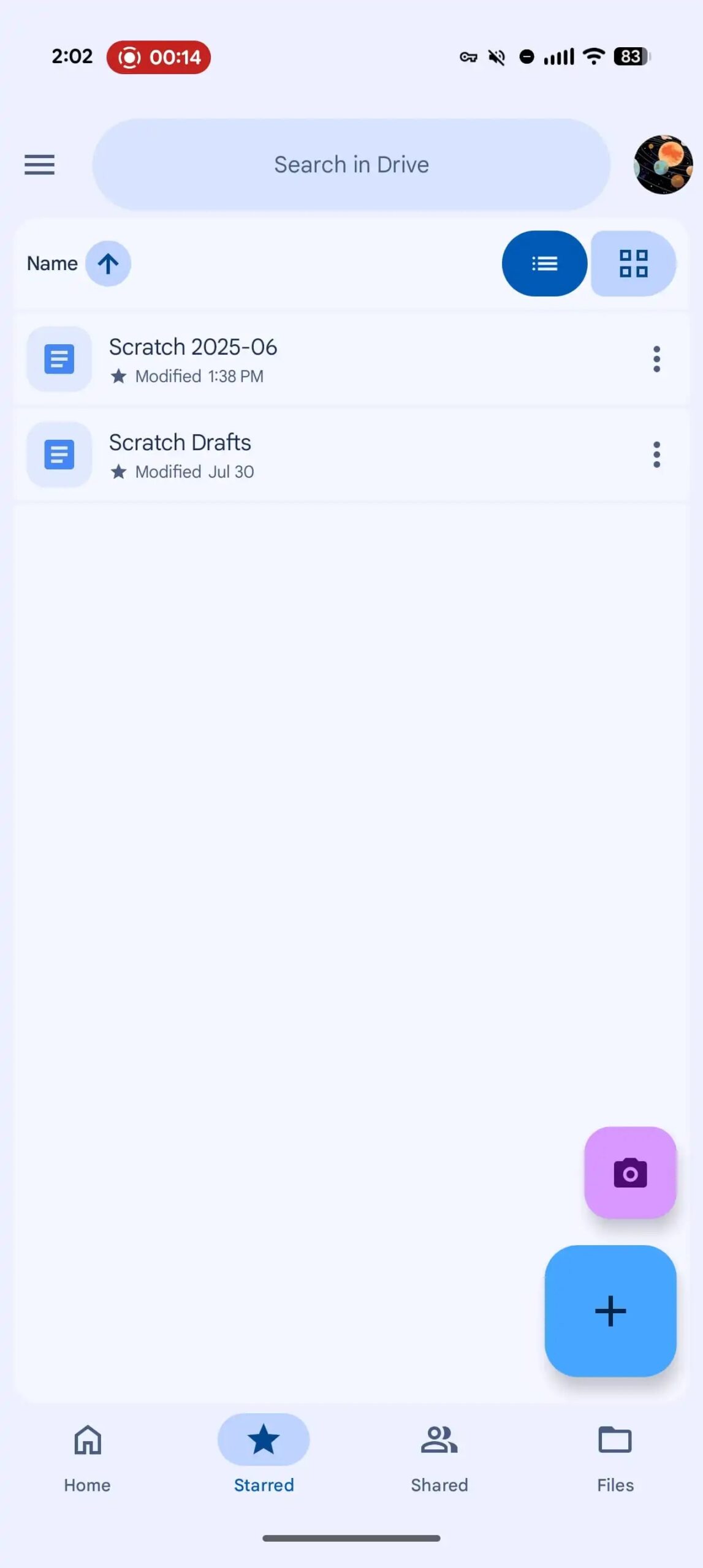
A new search app bar with a thicker field.
-
A shorter bottom bar for cleaner navigation.
-
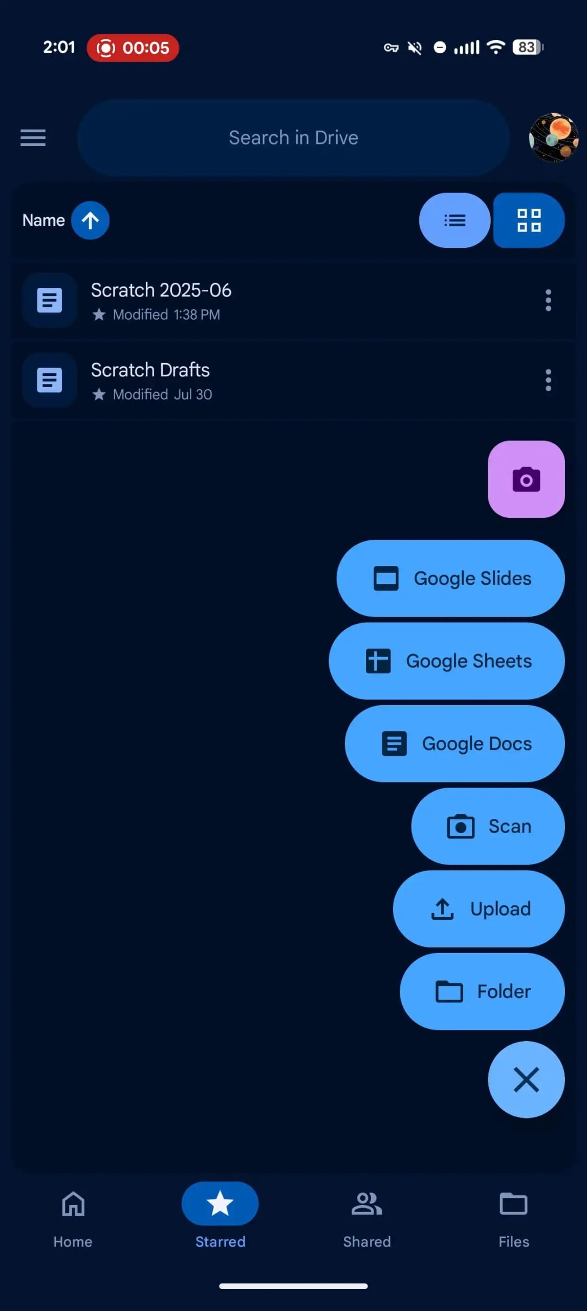
A redesigned floating action button (FAB) menu that replaces the old bottom sheet.
The FAB now offers quick access to Folder, Upload, Scan, Google Docs, Sheets, and Slides. While M3E guidelines recommend showing 2–6 related actions, this implementation creates a very tall menu compared to the old 3×2 grid. For some users, it feels less convenient for one-handed use.
Expressive Animations & Odd Choices
The pill-style animations used throughout the redesign are smooth and visually appealing, adding to the “expressive” feel of the UI. However, one quirk stands out: Drive now has two camera shortcuts — one in the main FAB menu and another in a stacked floating button above it, which may feel redundant.
Containers Everywhere
Another notable change is Google’s increased use of containers in list views:
-
A large rounded container now sits between the search bar and the bottom bar, both sharing the same background layer.
-
Each individual file or folder item is placed in its own container.
This layered approach adds visual separation but also makes the interface look busier than before. At the moment, this update isn’t fully rolled out to all users.
Still Rolling Out
Other tweaks, such as the button group in the top-right corner for switching between list and grid view, have yet to become widely available.
A Bigger Leap for Drive
Among Google’s apps, Drive seems to have embraced Material 3 Expressive the most aggressively, resulting in a major visual shift. While the redesign brings consistency and modern animations, the tall FAB menu and abundance of containers may take some getting used to.









Share your thoughts on this
We welcome your comments—just keep them respectful. No spam, ads, hate, or personal attacks.